
Pegboards might seem simple at first glance, just a humble wall of holes, but in the right hands they become a powerful tool for organisation, storytelling, and display design. From retail environments to events and pop-ups, they offer a flexible foundation that adapts as quickly as your stock, your space, or your ideas change.
In this post, we’re sharing some of our favourite pegboard setups from clients who use them in thoughtful, creative ways, each one showing just how much impact a simple system can have when it’s used well.
Why Pegboards?
- Totally flexible - Nothing here is fixed. Pegs, shelves, and rungs can shift in minutes, which means your display can evolve as your products do. It’s not about committing to a layout, it’s about having one that moves with you.
- Make the most of your space - Walls stop being background and start becoming active selling space. By moving vertically, you create room to show more without overwhelming the floor, especially valuable in compact stores, markets, or pop-ups.
- Clear, shoppable displays - Good displays don’t make people think too hard. Pegboards naturally bring products forward, keeping them visible, accessible, and easy to browse without visual noise getting in the way.
- Stylish and functional - When done well, the structure disappears into the brand. Timber panels and considered layouts don’t just hold products, they reinforce the tone and feel of the space itself.
- Reusable and sustainable - Instead of single-use fixtures, pegboards can be reworked again and again. Hire them, reconfigure them, or reuse them across events, a lower-waste approach that also makes commercial sense.
Custom Spoon Pegs
At an event at the Pullman Hotel, one client took a more bespoke approach, pairing our freestanding black pegboards with their own custom-made pegs.
What makes this interesting isn’t just the mix of components, but the collaboration it represents. The pegboard becomes a base layer rather than a finished solution, allowing existing elements to slot in seamlessly. It’s a reminder that the system is designed to flex around you, not the other way around.


Creating Uniformity
Red Parka consistently shows how controlled repetition can still feel dynamic. Using the smaller 6mm peg system and tight hole spacing, their colourful product range becomes almost architectural in its presentation.
At a glance, it feels orderly, but the interest comes from restraint. The uniform structure allows the product colour to do the talking, while still giving enough variation to keep the eye moving. It’s consistency, but not monotony, a balance pegboards handle particularly well.
A Unique Display Approach
Sometimes the most effective displays are the simplest in concept. This yarn setup uses the pegboard in a way that feels almost unexpected, with balls of yarn sitting directly over individual pegs rather than being “mounted” in a traditional sense.
What stands out here isn’t complexity, but playfulness. It’s a reminder that pegboards don’t dictate how products should behave, they simply offer a structure, and the interpretation is what makes it interesting. Even the lower sections of the board are used, which subtly reinforces the idea that every part of the surface has value.


Flexible in Retail Design
Bared Footwear shows how pegboards can move beyond functional display into brand expression. In their Melbourne store, custom-coloured pegboard panels were used to support a layout that feels intentional, clean, and highly curated.
Rather than treating all product equally, the arrangement creates rhythm. Sneakers and sandals are separated into distinct visual moments, giving each category its own space to breathe. The result is not just organisation, but a clearer reading of the brand’s range at a glance.
Utilising Wall Space
What we love about this setup from Hectic Decals is how naturally it shifts the eye upward without feeling forced. With smaller, detail-heavy products, it would be easy for everything to sit at table height and blend into one busy layer, but the pegboard changes that dynamic completely.
By lifting part of the range onto the wall, the display immediately feels more structured and intentional. The layout gains breathing room, individual products become easier to read, and the wall itself starts to feel like part of the story rather than background space. It’s a simple shift, but it completely changes how the range is experienced.

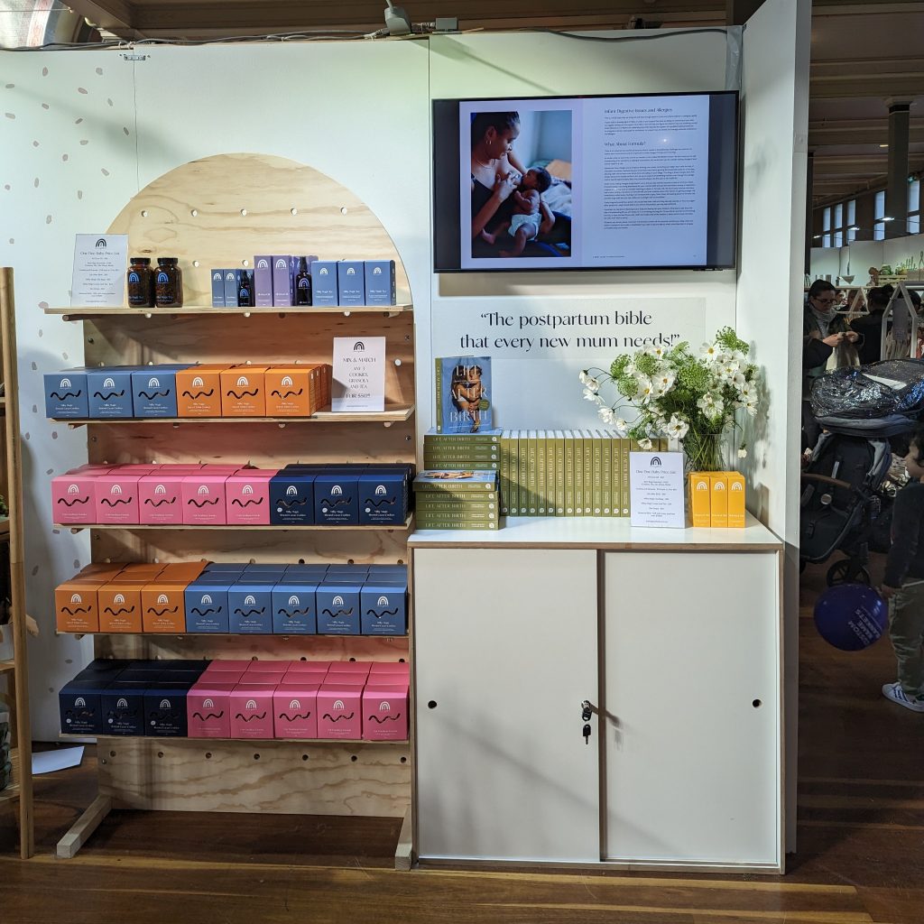
Shining at Expos
This Mama Goodness setup is a great example of how pegboards perform in high-pressure, fast-moving environments.
What stands out is how quickly the space comes together, but still feels considered once it’s built. Instead of overcomplicating the stall with heavy and time-consuming fixtures, the pegboard keeps everything lightweight and adaptable, which is exactly what you need in a setting where time, space, and attention are all limited.
We like how it still manages to create impact without relying on excess, the structure does the work, and the product naturally becomes the focus.
Tips on Making Your Pegboard Pop
- Design around your hero products first - Start with what you want people to notice first. Once those key pieces are placed, the rest of the layout naturally falls into place around them.
- Keep spacing intentional, not full - Empty space isn’t wasted space. It gives structure to the display and helps individual products stand out rather than compete for attention.
- Group products like a story, not a list - Think in small clusters rather than long rows. When products are grouped with intention, customers read the display faster and engage with it more easily.
- Mix display elements for texture - Pegs, shelves, and rungs all bring something slightly different. Using them together adds depth without needing extra props or visual clutter.
- Use signage sparingly but purposefully - A small amount of guidance goes a long way. Keep it simple, placed with intention, and let it support the product rather than compete with it.